UX/UI Design for Multiplayer FPS Game
- Jirawat Jumponkunawut
- May 8, 2022
- 2 min read
Updated: Aug 25, 2022
Project Wallriders
Team size: 5 - 6 members Duration: August 2021 - April 2022 (8 months)
Project Brief
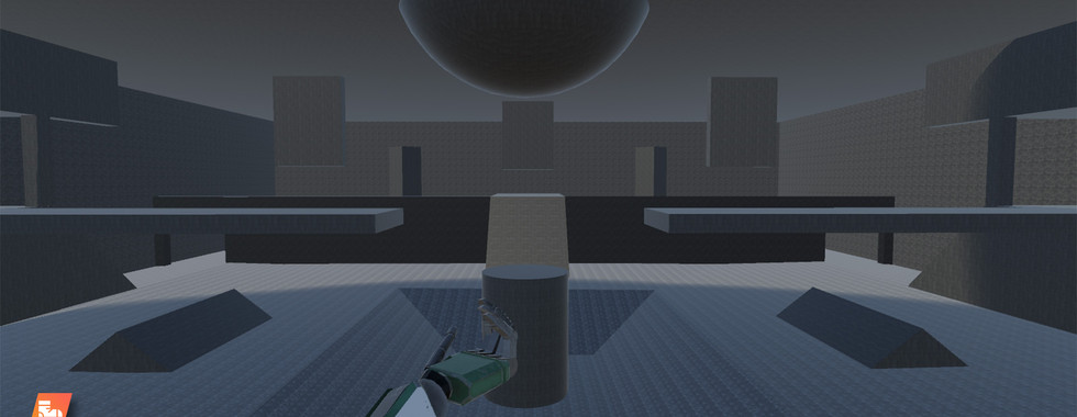
Wallriders is a first-person shooter game where 2 to 4 players duke it out in an arena where they can run and jump on the walls and ceiling. Each player can collect various quirky guns and will need to shoot the other players to win. Whoever gets to 10 kills first, wins the game.
Target Demographic
The intended audience will be competitive gamers, specifically those who are a fan of arena shooters like Doom and Quake with elements derivative of TitanFall to make the experience unique and distinct from any of the above games.
Responsibility / Contribution
Creative Design Director
UX/UI Designer
Game Feel Designer
Sound Designer
Artist
Download Link:
or
Table of Content
UX Goal
Project Wallriders is Sci-fi Paintball Match! not Warzone Simulator
UX Design Pillars
At a glance design
The player must be able to receive " vital information " within a split second.
Sports-Arcade Aesthetic
Bold design with vibrant colors
Casual Atmosphere
A humorous take on game dynamic 🤪
Cool Futuristic Setting
Emissive and Transparant elements
Research
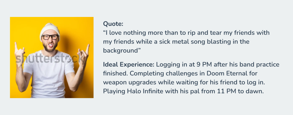
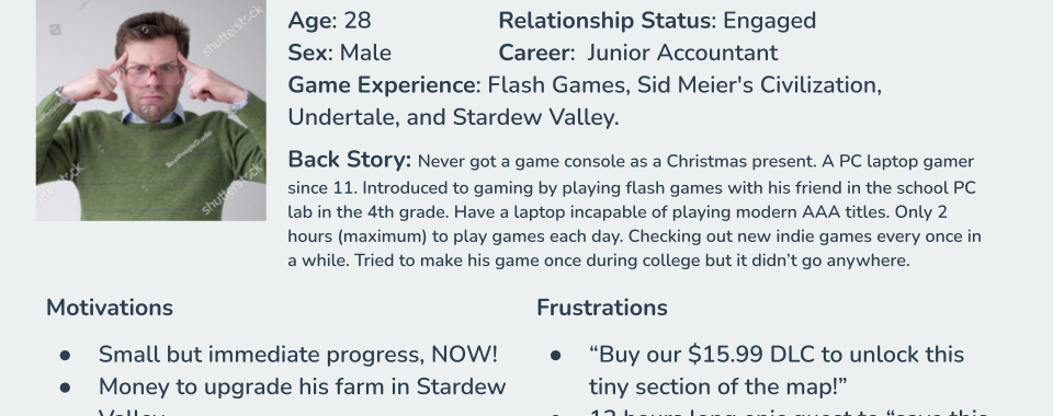
Persona
Competitor Analysis
Doom Eternal
Single player FPS game where the player uses various weapons to eliminate all demons.

⭕ Applicable Traits | ❌ Non-Applicable Traits |
|
|
Rocket League
An online 2 vs 2 soccer game, but with a car!

⭕ Applicable Traits | ❌ Non-Applicable Traits |
|
|
Titanfall 2
Futuristic online FPS game.

⭕ Applicable Traits | ❌ Non-Applicable Traits |
|
|
Moodboard
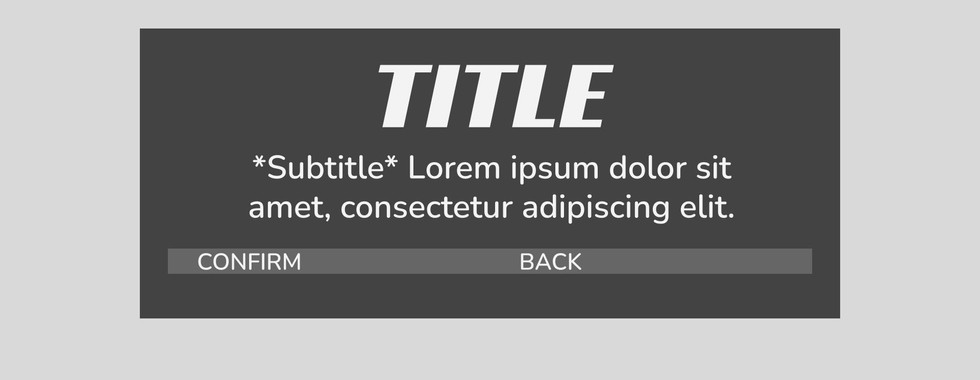
Wireframe
User Flow

Mockup
High-fidelity mock-up made in Adobe Photoshop.
Implementation
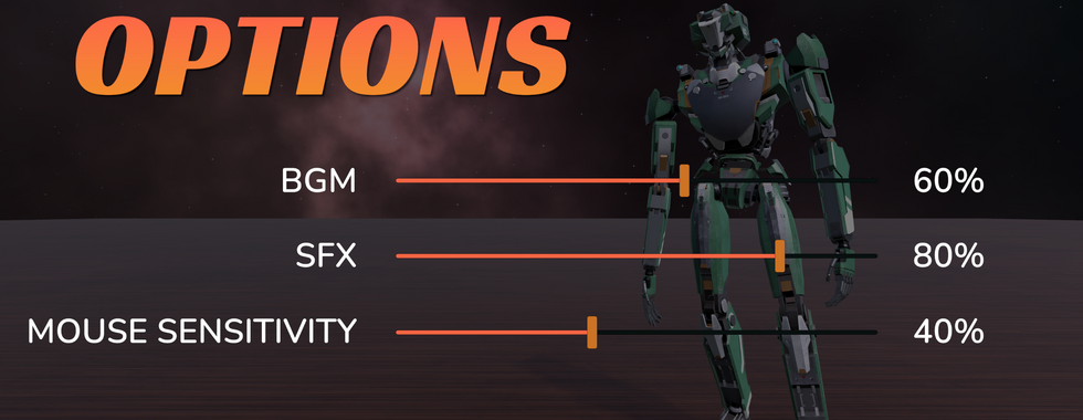
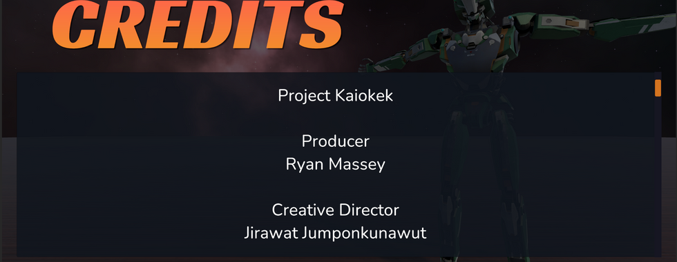
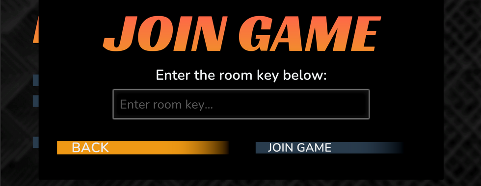
High-fidelity mock-ups are converted into UI assets.
The UIs are assembled in Unity using Mockup and User Flow map as a guide.

Testing
The formal playtesting was conducted in December 2021 using the interview method.
From testing data, we concluded that:
Although the overall experience feels unpolish, they were no immersion-breaking moments in the UX flows.
While most didn’t argue against using the weapon wheel as a solution for having many guns, some find it distasteful.
There was a concern for the text size in labels and buttons, the playtester stated that the lack of padding might make the text difficult to read.
Pivot
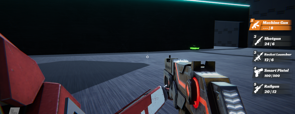
Weapon wheel to weapon list
The number of guns change during development period
From testing data and development constraints, the weapon wheel is replaced by the weapon list design for these improvements:
The weapon wheel takes over 30% of screen space while the weapon list takes less than 18%.
*Contradicting the “At a glance design” design pillar.
There is no easy way to scale the number of guns using the weapon wheel. While the linear design of the weapon list allows the number of guns to be scaled easily.
*Development constraint
The rotated icons in the weapon wheel make the gun option difficult to recognize.
*Contradicting the “At a glance design” design pillar.
Remove timer as a win-lose condition
*Development constraint
Drop controller support
*Development constraint
Game Control Screen added per DigiPen requirement
*Development constraint
End Product
Retrospective
Successes 😊
Along with the feedback design, this project followed design pillars and produce the desired experience.
The UX in this project has a distinct and cohesive theme.
The design doesn’t demand a cognitive load and is highly skimmable.
The design layout has cohesive size and spacing.
Failures 😥
Compare to UX design standards like Google Material 3.0, the text elements in this game lack spacing and padding which make it difficult to read.
The free-hand layout can be substituted with a grid system which should allow the layout to be more cohesive.
The color choice can be reconsidered to increase contrast for the sake of readability.
The missing small-animation and transition effect should allow the design to appear more polished.

















Comments